Project Background
Fibergé Knits & Bolts is a boutique yarn and sewing store located in an up-and-coming area of Cincinnati. They carry unique products, such as yarns that have been hand-dyed and quilting fabrics that can’t be found in other establishments around the area.The Problem Sales have been down, and they wanted to change the business model to accommodate online sales as well as maintain the brick-and-mortar location.
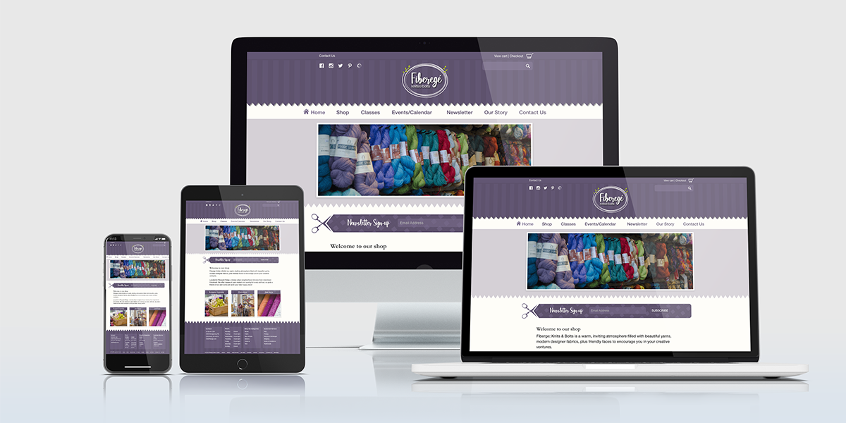
The Solution The solution was to create a new e-commerce website that made it easy to place orders and locate information about special events and classes being held. To keep the cost down I was the sole UX/UI designer.
My Role Research, Stakeholder Interviews, User Interviews, Sketches, Wireframes, User Testing, Social Media Marketing Strategy, and Design.
Tools Adobe Illustrator, Adobe Photoshop, Adobe XD, Survey Monkey, Google, Facebook and Instagram Analytics, Serpstat, SEMRush.
Design Process
Empathize
The first step in the process was to gain insights into what the target audience wanted, needed, how they behaved, feel, and think, and why they demonstrate such behaviors, feelings, and thoughts when interacting with the brand.The Challenge This step proved to be a challenge. Fibergé Knits and Bolts stakeholders were not sure who their target market was. The business had changed owners three times since they first opened as a fiber store for weavers to the present business model.
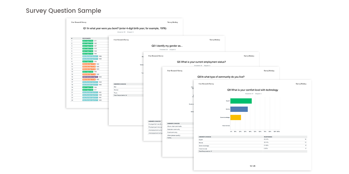
The Solution I created a user survey to gather more data on the user to pinpoint the target market. The survey was sent to current customers and posted across social media channels. The survey was used to gather demographics, expectations, preferences, and goals.
Define
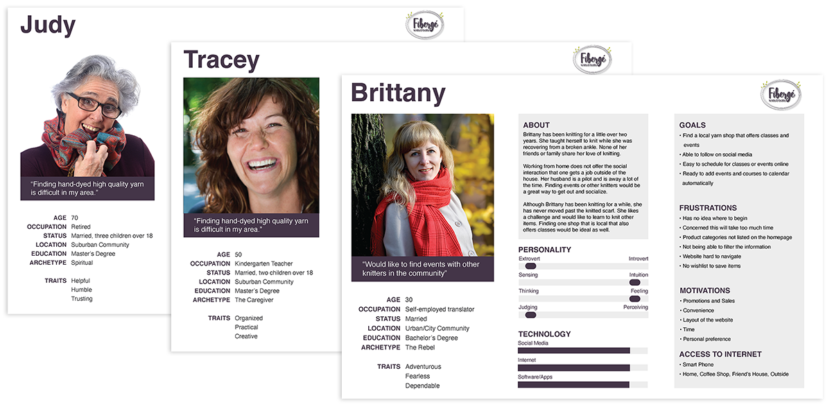
Stakeholder Interviews As part of the new business strategy, I held a kickoff meeting. The purpose of this meeting was to get to know Fibergé Knits & Bolt's history, to share data from the survey, and to make sure everyone was on the same page for the project. My key findings:Existing Data - Facebook, Website Since the website and Facebook page had been up-and-running for some time, I was able to leverage some of the user data from those sources as well. This data along with the user survey data was used to build personas and pain points.
Ideate
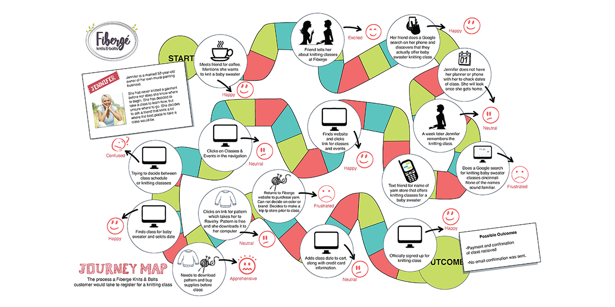
User Journey Next, I created a user journey to dig deeper into the user’s process of signing up for a class. This helped me to understand some of the user’s most common pain points and ultimately what the best solution would be.SWOT Analysis & Competitors Analysis I conducted a SWOT analysis to summarize the current state of the company and devised a plan. Fibergé Knits & Bolts is looking to expand operations with a competitive analysis of its strengths and weaknesses in comparison to its current competitors. The goal of the SWOT Analysis was to assess the differences between their competitors to find opportunities or threats that could affect the business development.
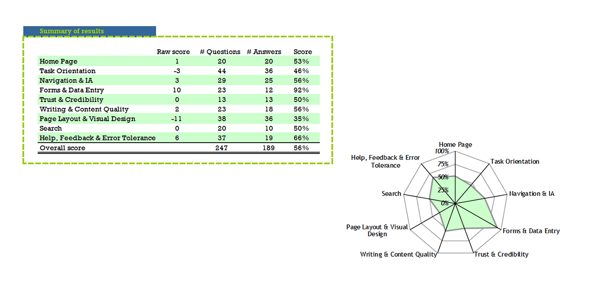
Other Research I had three UX peer evaluators do a Heuristic Evaluation to examine the interface and judge its compliance with recognized usability principles. I did a keyword comparison using the two competitors to gather unique keywords. The result was only a few unique keywords. Looking at the source code I found that the meta tags were undefined. I recommended adding ten unique keywords to the meta tags. From the graphics, you can see when the keywords were added. This resulted in a 45% increase in traffic to the website and a 55% increasein foot traffic to the business location
User Journey
I created a user journey to dig deeper into the customer’s process of signing up for a class. This helped me to understand some of the user’s most common pain points and ultimately what the best solution would be.
Ideation Workshop With all the research at hand, I arranged for an ideation workshop with the stakeholder. We created and answered “how might we” questions to brainstorm solutions that best fit the user so that the primary navigation and content layout was intuitive.
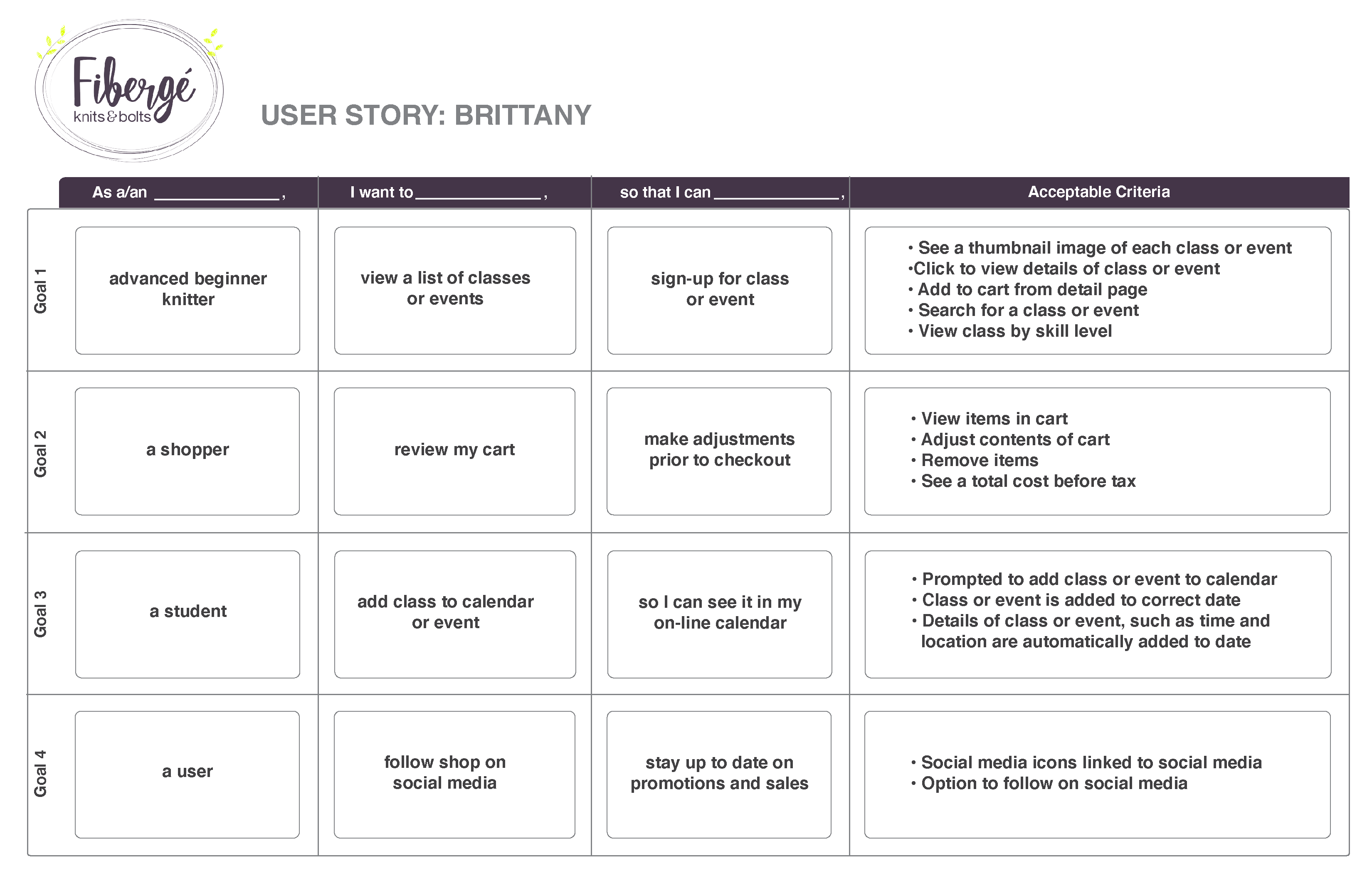
To articulate the “how might we” will provide value to the user, I created a user stories for each persona with acceptable criteria .
Learn if participants were able to complete specified tasks successfully
Identify how long it takes to complete specified tasks
Find out how satisfied participants are with the site or other product
Identify changes required to improve user performance and satisfaction
And analyze the performance to see if it meets usability objectives
Ideation Workshop With all the research at hand, I arranged for an ideation workshop with the stakeholder. We created and answered “how might we” questions to brainstorm solutions that best fit the user so that the primary navigation and content layout was intuitive.
To articulate the “how might we” will provide value to the user, I created a user stories for each persona with acceptable criteria .
Other Research
I had three UX peer evaluators do a Heuristic Evaluation to examine the interface and judge its compliance with recognized usability principles. I did a keyword comparison using the two competitors to gather unique keywords. The result was only a few unique keywords. Looking at the source code I found that the meta tags were undefined. I recommended adding ten unique keywords to the meta tags. From the graphics, you can see when the keywords were added. This resulted in a 45% increase in traffic to the website and a 55% increasein foot traffic to the business location
Testing & Prototype
The goal of the usability assessment was to understand how real users interact with the current website and make changes based on the results.The Goal
The Problem & Solution
The client’s website was hosted through a point-of-sale server I wanted to first test the current website to pinpoint usability issues that may hinder the functionality of the new website. Identifying and fixing problems before building out a prototype kept the cost within the intended budget.The Problem & Solution
The client’s website was hosted through a point-of-sale server I wanted to first test the current website to pinpoint usability issues that may hinder the functionality of the new website. Identifying and fixing problems before building out a prototype kept the cost within the intended budget.
I chose 5 participants based on the personas from the data collected. Each participant filled out a 10-question pre-observation survey. This was used to gather information surrounding:
Demographic information
Relationship status
Education level
Internet use
the device used the most to connect to the internet
Before I began the assessment, I stressed to the participant that this was not a test, there were no right or wrong answers and encouraged them to speak freely to help improve the website. Each participant was given <b>four scenarios and tasks to accomplish</b> for each scenario. Each task was based on data gathered during the ideation workshop. All participants used their preferred device.
The intended audience was unclear
The content was hard to read due to color, font choice, long cluttered pages
Terminology was confusing
Product was hard to find or required more than 3 clicks taking them further from their desired goal
Images lacked a consistent size
Broken links or wrong product listed
Before I began the assessment, I stressed to the participant that this was not a test, there were no right or wrong answers and encouraged them to speak freely to help improve the website. Each participant was given <b>four scenarios and tasks to accomplish</b> for each scenario. Each task was based on data gathered during the ideation workshop. All participants used their preferred device.
Testing Results
Prototype
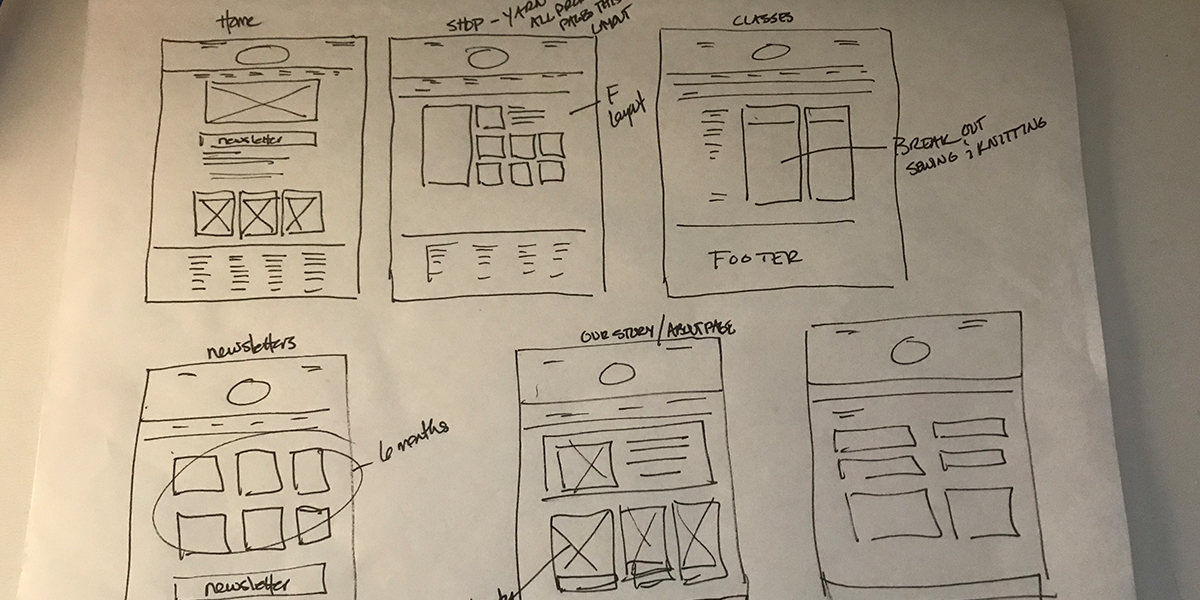
From the data gathered during the usability assessment, I sketched out wireframes. From the wireframes, I built out a working prototype of the purposed website.
View Prototype
The second challenge was budget constraints, so I had to do the bulk of the usability research that normally a UX team would do.
The third challenge was the constraints with the point-of-sale server. I discovered that the company is marketing itself as templates but is only coding the index page. There is not a global CSS sheet that allows changes to flow across the pages which results in an inconsistency between the home page and the pages following.
The fourth challenge was teaching the client how to add images and meta tags to the code. This is not a drag and drop format as the hosting site claims. Unless you know HTML and CSS it is very easy to mess up the template resulting in inconsistent image sizes and layouts.
Conclusion
In the end, I created a website that was useful to the user and the client was able to better understand their users from the data I collected.Challenges
The first challenge was pushback from one of the stakeholders despite the data that was presented. There was a lot of starting and stopping of the project, which resulted in the project taking longer than anticipated.The second challenge was budget constraints, so I had to do the bulk of the usability research that normally a UX team would do.
The third challenge was the constraints with the point-of-sale server. I discovered that the company is marketing itself as templates but is only coding the index page. There is not a global CSS sheet that allows changes to flow across the pages which results in an inconsistency between the home page and the pages following.
The fourth challenge was teaching the client how to add images and meta tags to the code. This is not a drag and drop format as the hosting site claims. Unless you know HTML and CSS it is very easy to mess up the template resulting in inconsistent image sizes and layouts.

