Background
Global Relief is a small nonprofit emergency response organization that provides an immediate response to emergency medical needs – and supports long-term humanitarian assistance programs – for all people around the world, regardless of race, creed, or political persuasion.The Problem
Global Relief is a startup that knows the importance of having a strong brand. They reached out to me to create a brand that would reflect their mission and personality.The Challenge
Was to create a brand identity to be used for print collateral, digital, and social media.My Process
Research: In my process, I conducted a zoom workshop to learn more about the team, their mission, and future goals. From the initial research and information, I gathered from the workshop I was able to sit down with my sketchbook and sketch to get ideas out of my head and down on paper.My Solution
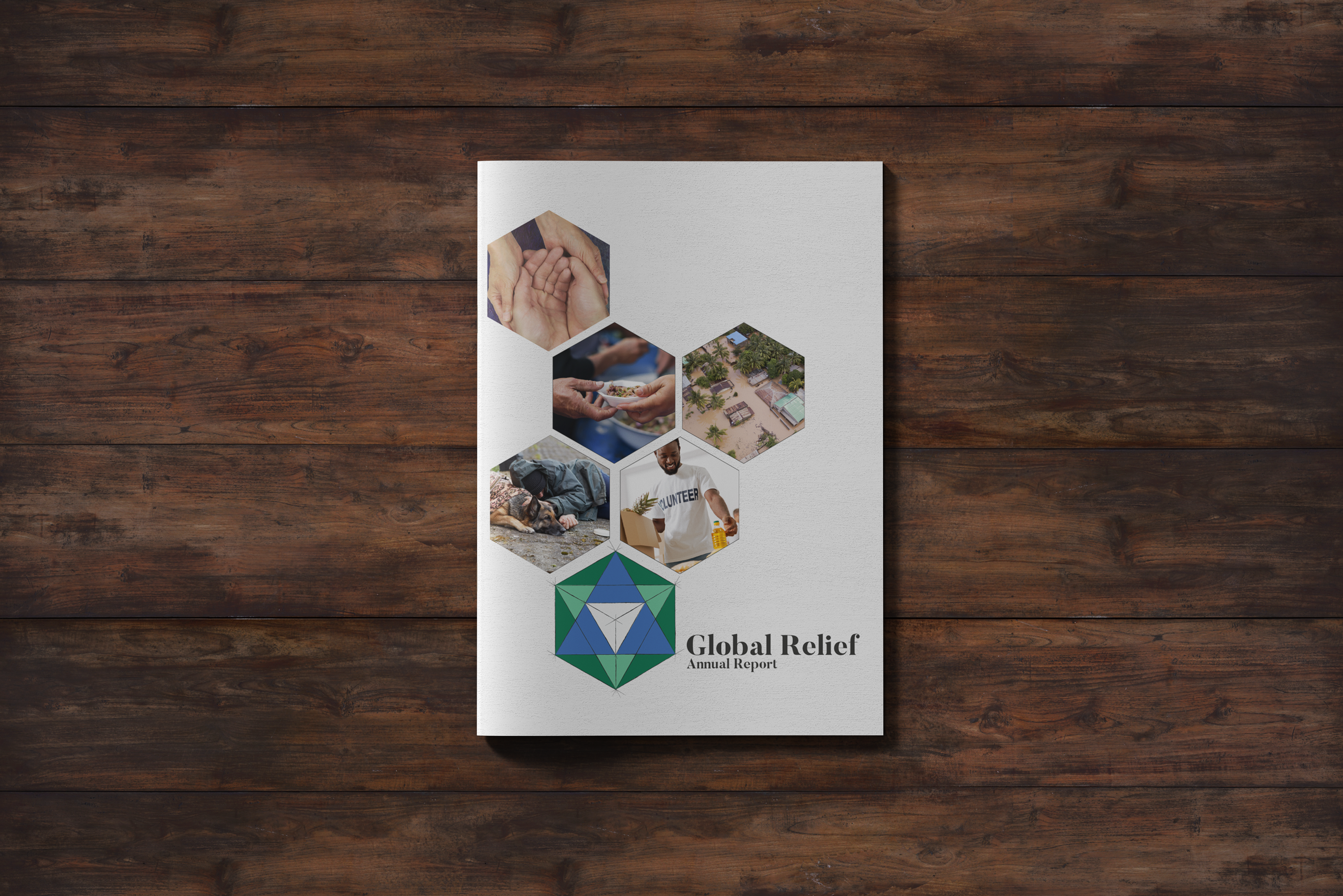
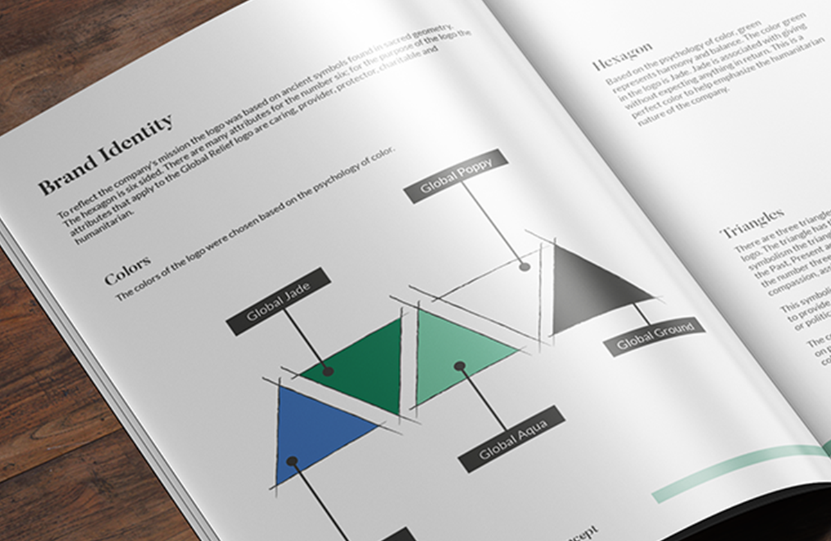
For this design, I wanted to focus on strength. From my research two of the strongest shapes in nature are the hexagon and triangle. I designed the logo based on ancient symbols found in sacred geometry.The hexagon is the strongest shape known to hold a lot of weight. Hexagonal patterns are prevalent due to their efficiency.
The hexagon is six-sided. Attributes for the number six are caring, providing, protecting, charity, and humanitarian.
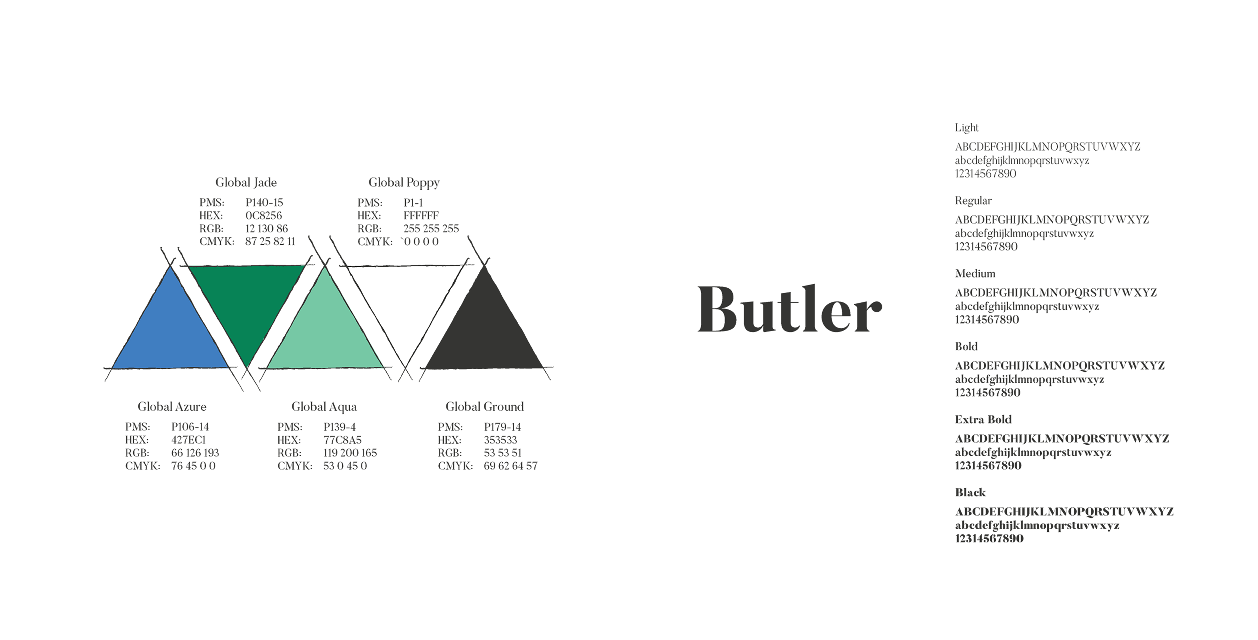
I chose jade for the hexagon. Based on the psychology of color, green represents harmony and balance. Jade is associated with giving without expecting anything in return, which makes this the ideal color to be used in the logo to help emphasize the humanitarian nature of the company.
There are three triangles in the Global Relief logo. A triangle is the most rigid shape because forces on a triangle are distributed evenly along its three sides
In ancient symbolism, the triangle was used to represent the Past, Present, and Future.
In Numerology, the number three represents optimism, compassion, assistance, and culture. This symbolism reflects the company’s mission to provide support regardless of race, creed, or political persuasion.
The colors of the triangles were chosen based on the psychology of color. Aqua was chosen for its representation of offering a sense of protection and healing. A triangle with the point down is the female, epitomizing the nurturer.
A triangle placed point end up indicates strength. Although the selected color, Azure Blue, is a calming color, it is a color that inspires determination and a sense of purpose.
The color white represents new beginnings. The white triangle is centered in the logo to draw your eye to what seems like the smallest part of the logo when, in reality, it represents new beginnings.

